Banking
Piraeus Bank — winbank ecosystem
Modernizing Greece's largest bank digital platform across 27 assignments, 9 months, without disrupting the trust of millions of daily users.
Scope
Context
Piraeus Bank is Greece's largest bank — millions of users, legacy infrastructure, and zero tolerance for disruption. I came in as Product Designer and UX Consultant via Code.Hub, embedded across UX and Rapid Response teams. The mandate: modernize winbank (the digital banking platform) across web and mobile without breaking the trust of the people who depend on it daily.
No unified design system. Fragmented documentation. 27 parallel assignments across retail (B2C) and corporate (B2B) banking, each with its own stakeholders and technical constraints.
How I Worked
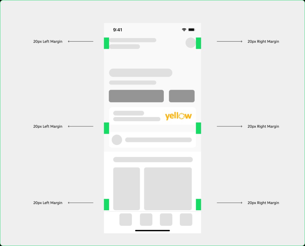
Every project started with a brief and a stakeholder workshop — requirements, technical constraints, what had already been built. From there: a UX audit of existing designs to benchmark navigation and identify drop-off points. I built a minimal UI kit in Figma to maintain visual consistency across parallel projects, maintained a Notion documentation system tracking every decision, and used Stark for contrast validation.
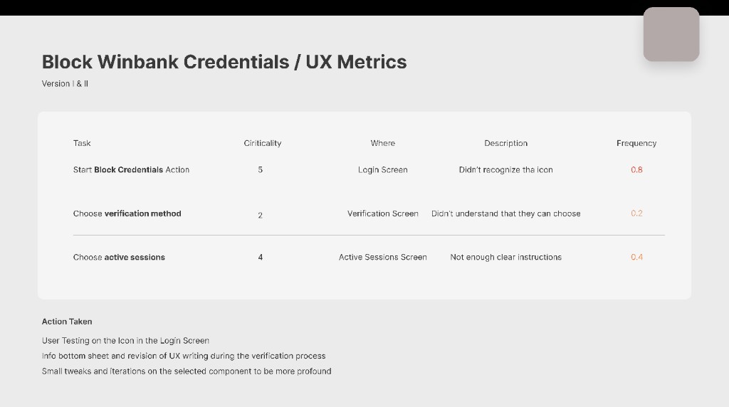
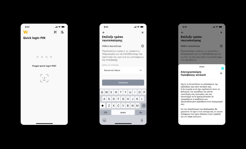
Block Winbank Credentials
The brief: give users a fast, unambiguous way to block their access credentials — available right from the login screen, at the exact moment they'd need it most. I applied the Zeigarnik Effect and Law of Minimal Effort — reducing cognitive cost and reframing the block action as something the user controls, not a failure event.
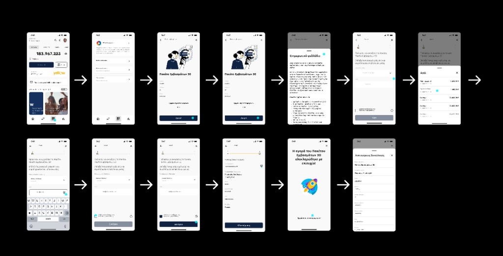
Remittance Packages
Goal: help users explore, select, and send prepaid remittances clearly. The first round of prototypes ran into backend constraints I hadn't accounted for. I changed the process: from that point on, every sprint opened with a co-definition session with backend and payments teams before any screens were touched. Progressive disclosure structured the final experience.
Results
Nine months. 27 assignments. 20 projects shipped across web and mobile. Support ticket volume reduced through clearer credential and remittance flows. The product team shifted from reactive firefighting to structured sprint cadences — that process change mattered as much as the screens.
Gallery
Outcomes