B2B SaaS / Telecom
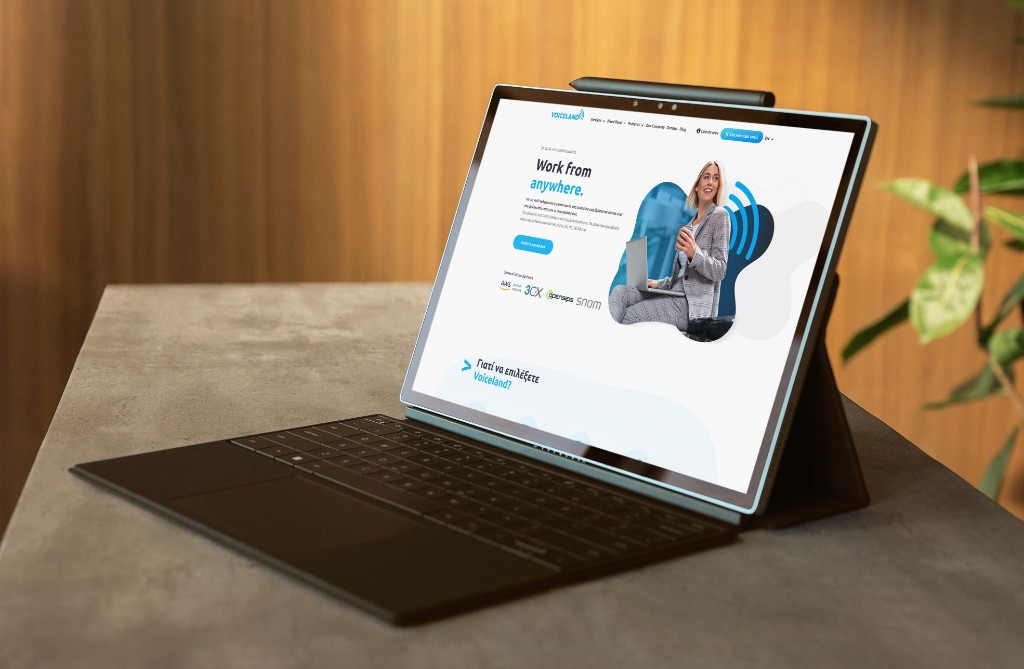
Voiceland — cloud telephony redesign
Redesigning a Greek VoIP provider's site from the IA up — mega menu surgery, pricing page overhaul, and leading a junior designer through a live client engagement.
Scope
The Brief
Voiceland is a Greek VoIP provider — PBX, call routing, conferencing, and analytics — serving businesses from freelancers to large enterprises. The existing site was technically functional but architecturally broken: the information hierarchy didn't reflect the product's depth, the pricing page caused drop-off before conversion, and the overall experience was misaligned with the modern, scalable brand Voiceland wanted to project.
I came in as Senior External Design Partner and Project Manager — owning the full UX architecture of the redesign while directing a junior designer on execution.

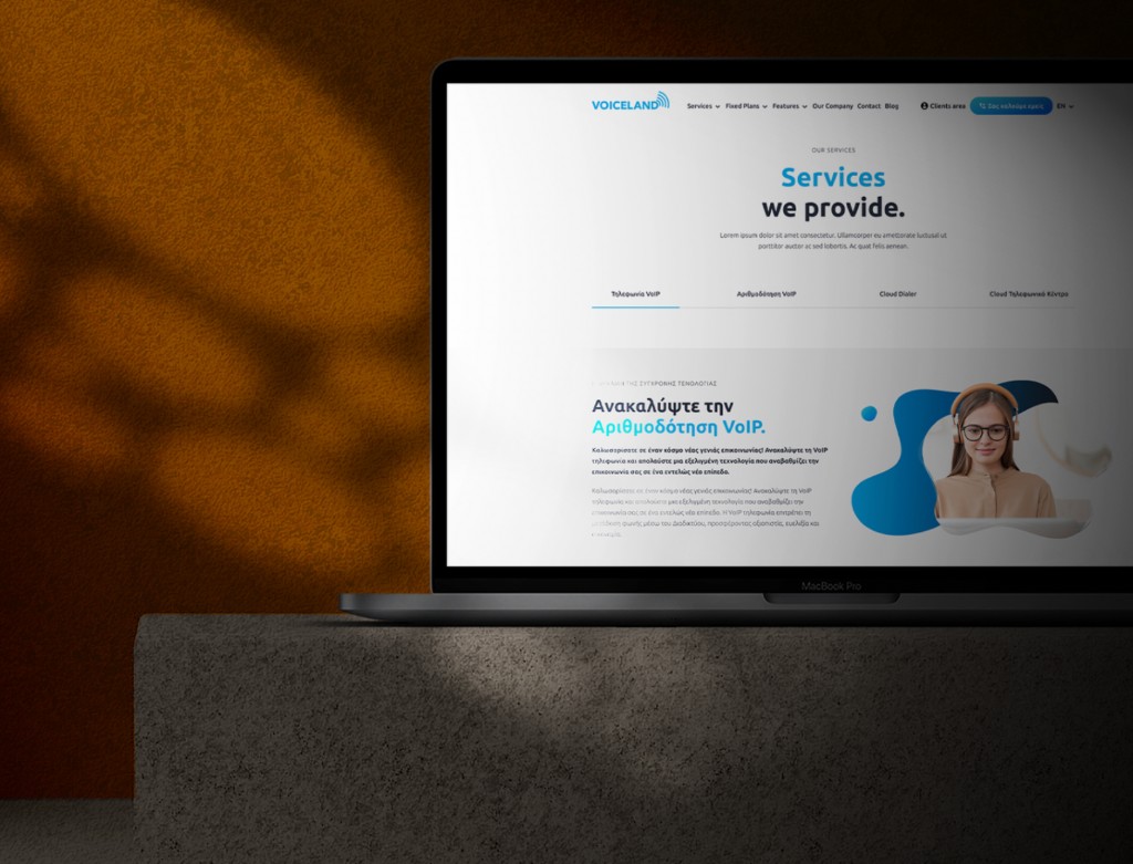
The Mega Menu as IA Surgery
The most impactful single decision was rearchitecting navigation as a mega menu. Voiceland's range — VoIP plans, conference tools, call recording, PBX management, remote numbers — could not live in a flat nav bar without either burying options or overloading the header.
The mega menu grouped services by use case (individual, team, enterprise), surfaced the most-searched features immediately, and let users orient themselves before landing on a page.
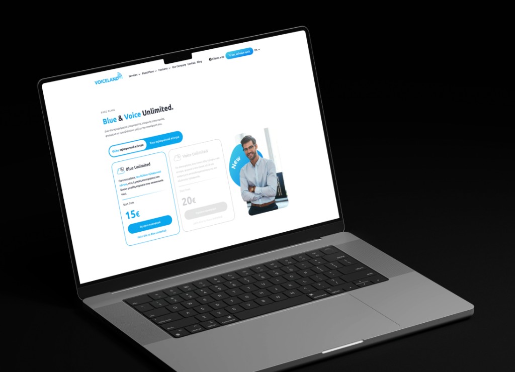
Pricing: From Confusion to Scan-Ready
The pricing page got a full UX architecture overhaul. Feature rows grouped by category rather than listed flat — users could scan across tiers horizontally and identify the right plan for their scale without reading every cell.
Leading the project
This was my first time leading another designer on a live client engagement. I structured it as deliberately as I structured the IA: I owned the upstream strategic work — IA research, stakeholder workshops, design rationale presentations. She owned execution under structure. Every screen got audited before dev handoff.
The structure worked. The project shipped. The team kept using the system after I rolled off.
Gallery
Outcomes