Consumer Fintech · Cash Advance
Credit Genie — Consumer Cash-Advance, End-to-End
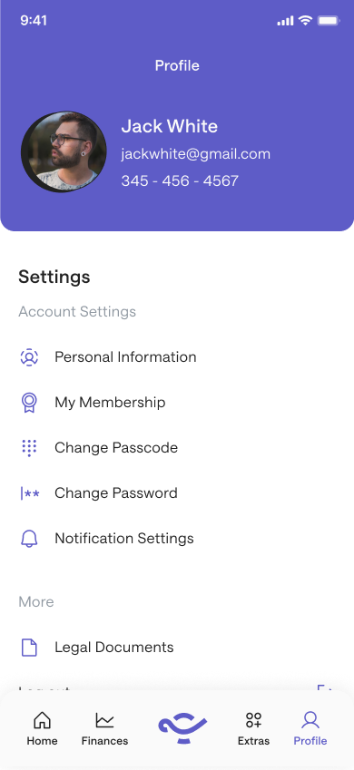
External Lead Designer on the full Credit Genie redesign — every flow, every screen, plus a documented design system. Currently 4.8★ from 94K+ App Store ratings.
Scope
Most fintech is designed for the median customer, calm, curious, making a considered choice. Credit Genie is not, and that is the whole problem.
The people who open a cash-advance app are not browsing. They need money before payday, and they need it now. Their attention is split, their patience is short, their trust is already low, and many of them have been burned before by products that looked exactly like this one and turned out to be predatory. You are not designing for someone in a calm state. You are designing for someone under pressure who has good reason not to trust you.
That is the category. Cash advance, the same space as Brigit, Earnin, and MoneyLion in the US. It is also one of the most regulated consumer fintech categories there is. State-by-state lending rules. Fee-transparency requirements. A customer base that is, by definition, financially stressed. Every screen has to hold three things at once. Speed, because they need it now. Transparency, because they have to understand what they are agreeing to. Trust, because they are handing you the most sensitive credentials they own.
I came on as the external lead designer for the full redesign. Every flow, every screen, onboarding through finances, insights, offers, profile and membership, plus a documented design system to hand to engineering. The branding evolved in-house after I rolled off. The UX and interaction architecture live in the app today is what I shipped.
The user is not the median
When you design for someone in financial stress, your usual instincts betray you. You want to be friendly, so you add personality. You want to be helpful, so you add explanation. You want to convert, so you nudge. Every one of those instincts, applied here, makes the product feel like the predatory thing the user is already afraid of.
So the posture flips. Plain over clever. Explicit over reassuring. Control over nudging. At every moment the user should know exactly what is happening to their money and exactly what they are agreeing to. That is the bar in regulated consumer fintech. Anything less is the wrong product for this person.
The trust bottleneck
The hardest screen in the product is the one that asks for a bank account.
Bank linking is the gate. Without it nothing happens. No advance calculated, no underwriting, no money. With it, the user has handed over the most sensitive credentials they own, to a category they have every reason to distrust.
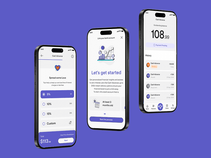
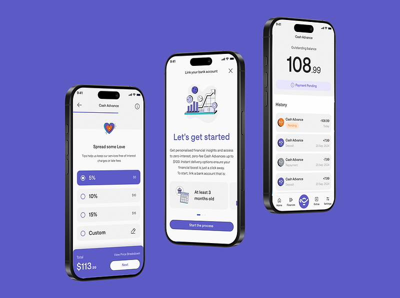
The instinct is to reduce friction on this screen. The better answer is to earn it. The flow leads with what the user gets, instant insights, zero-interest advances, fast delivery, before it asks for anything. The link itself is one tap, with plain language about what happens next. The requirement that the account be at least three months old is surfaced up front, not sprung as a rejection after the user has already committed. You do not hide the cost of trust. You show why it is worth paying before you ask for it.

The tip selector, where ethics and conversion meet hardest
The service is funded by tips. Five, ten, fifteen percent, or custom. The tip is voluntary. It is also the primary revenue model. That one sentence is the whole tension.
A high pre-selected tip optimises revenue and feels manipulative. An unselected default protects trust and tanks conversion. There is no clean answer, only a line you have to find by hand. The shipped pattern is a clearly labelled selector that shows the impact of each choice on the total in real time, with a custom option that hands the user full control. It took several iterations to find the version that converted without coercing.
The "Spread some Love" framing was deliberate. It treats the tip as a contribution that keeps fee-free, interest-free advances available, not as a charge hidden in the flow. That framing is what lets a user feel fine about choosing five instead of fifteen. In this category, that feeling is not a nicety. It is the ethical centre of the product.
The lesson I did not see coming: agreement is not understanding
Here is the part I would put on the wall for any designer about to lead a redesign.
The stakeholders loved everything. Every recommendation I brought them, they were positive about. At the time it felt like the project going beautifully. It was not. They were agreeing with the direction in general, the cleaner look, the simpler flows, the better onboarding. They were not understanding the specific UX decisions underneath, because I was showing them the wrong things.
It surfaced the moment we started building the first real screens. The general enthusiasm did not survive contact with specifics. Decisions that had been waved through as flowcharts and wireframes suddenly needed defending, because nobody had truly absorbed them the first time. They had nodded at diagrams they never had time to study.
That was the lesson, and I have carried it into every project since. Stakeholders do not read flowcharts. They do not study wireframes. They are busy, and a diagram quietly asks them to do the translation work themselves. So you do it for them. You show the UX in motion. You walk them through real scenarios. You say, here is a person who just got paid late, here is exactly what they see and what they feel, and here is why this screen is built the way it is. You advocate for each decision in the language of the human it is for.
Easy agreement is a warning sign, not a win. The thing you are actually after is understanding, and it does not come from artifacts. It comes from telling the story out loud.
Repayment and support
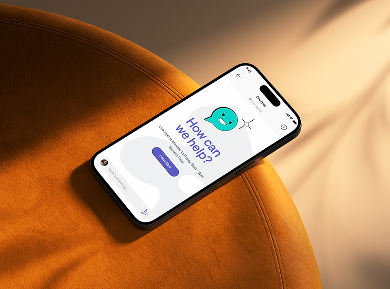
Two surfaces carry the relationship after the advance. Repayment leads with the outstanding balance as the dominant element, then the recent activity beneath it in plain chronological order, with status markers, pending, today, dated, so the user always knows where they stand in time. Support is built as a way to a human, not a wall in front of one. When a bank link breaks or an advance is rejected, the user needs a person fast, so the chatbot triages and routes rather than deflects, posts its real hours, and confirms identity before anything sensitive is discussed.
One year later
This was a contract. At the end, the UX architecture, the flows, and the documented design system were handed to the in-house team. What is live today is built on that handoff, not rebuilt from it. That is the contract lead's job done right. You leave something solid enough that the people who come after you can keep building, instead of starting over.
A year on, the numbers do the talking. 4.8 stars on the US App Store, from more than 94,000 ratings. A live product, still iterating. The architecture held.
What this taught me
Cash advance is one of the few categories where bad UX has direct ethical consequences. A confusing tip selector becomes a hidden fee. A heavy onboarding becomes a wall in front of the people who actually need the product. A badly routed support flow becomes a trapped customer. The work was making sure that at every moment, the user knew what was happening to their money and what they were agreeing to.
But the lesson I keep is not about screens. It is that the hardest part of UX is rarely the design. It is getting the people around the design to truly understand it, not just approve it. The screens were never going to fail this product. Misunderstood decisions were. Part of being a senior designer is closing that gap on purpose, advocating, narrating, making people see the why, so that the product that ships is the one you actually designed.
Gallery
Outcomes