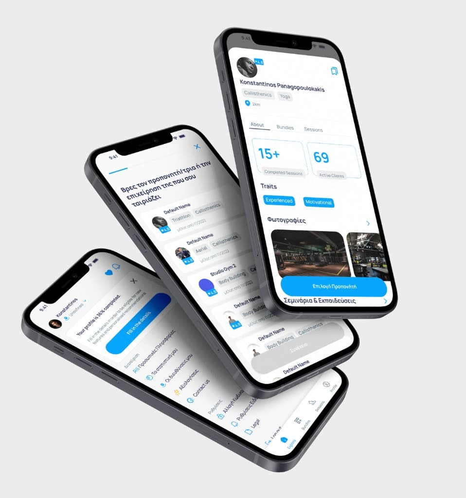
CoachMe · two years with a young team, turning a rough MVP into a product people used
Two years with a young team that messaged me to help finish their coaching-marketplace MVP. We refined it, got closer to real users than I ever had, and shipped a second version people genuinely used. The product worked. The business behind it did not, and it closed in 2025.
Scope
At a glance
CoachMe started as three or four young guys building an idea from nothing. In April 2023 they sent me a message. They were looking for someone more senior to help them finish a product that was already live as an MVP, in beta, with a handful of real clients.
What made me want to do it was how much they had already tried. They cared about the things founders usually skip: organisation, documentation, doing it properly, even when it was still rough. They had a junior designer on the team already. I came in to help it move more smoothly, to refine the mistakes, and to push the app one real step forward.
What it needed, and what there was no time for
The app was in the usual state of an early product. Inconsistencies everywhere, no real design system, a long list of things that would have to be reworked before it could be genuinely good. But that was not the job yet. There was no time to rebuild the foundations, and trying would have stalled everything.
So I worked closely with the junior designer on the pain points that mattered right then, and I wrote everything else into a backlog I shared with the team. Not fixed, but named, dated, and visible, so nothing got lost and the founders could see the real shape of the work ahead.
The pain points, plainly
To be clear about what "refine" actually meant, here is some of what was wrong. Font sizes so small they were neither legible nor accessible. Colour contrast that failed. Buttons crowded so close together that tapping the one you wanted was a gamble, two actions side by side with no room for a finger to land. And screens where you could not tell what you were meant to do, which is an information architecture problem wearing a visual-design costume.
None of it is glamorous. All of it is the difference between an app people tolerate and an app people use.
The closest I had been to real users
After the first six months, with the revisions in place, we tested the real product with real clients. Then we started on version two, and this is the part I remember most fondly.
The founders had close, direct relationships with the people using the app. Feedback arrived instantly: features people wanted, problems we had no idea existed, the things you only learn when someone tells you to your face. For research, it was a genuine delight. We ran surveys to understand what was really going on, scored usability with the System Usability Scale, and the numbers came back good and the feedback better. The cofounders sat with people while they used the app, watching where they hesitated. I had never been that close to real users, or had that much honest data about who they were.
Version two
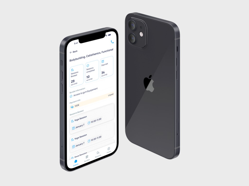
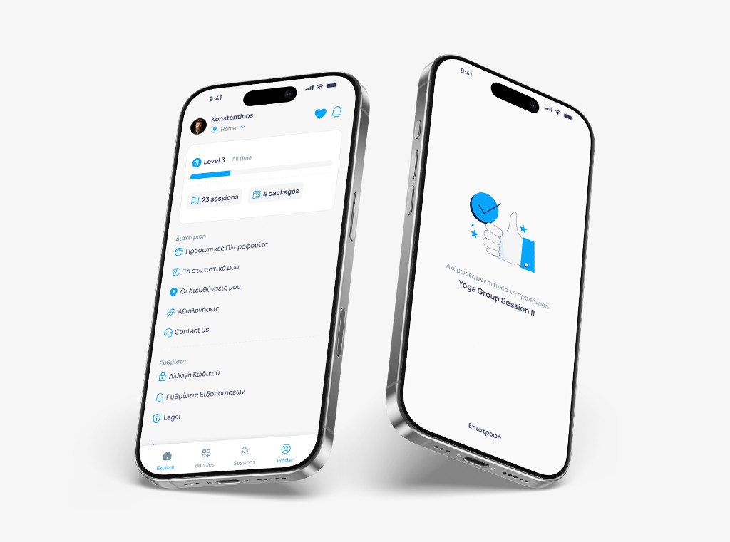
The backlog earned its keep here. Version two used it as the plan. We added payments, gave gyms the ability to add and remove their own trainers, and rebuilt the filtering and tag system so it could hold the different things different people were looking for. The UI changed with it, into a more robust brand identity that read as a product rather than a prototype.
As the userbase grew, professionals and athletes started needing genuinely different things, so we split the app into two experiences, one for each. The same product underneath, two surfaces on top, each shaped around what that person actually came to do.
Orienting people before they browsed
The first version dropped a new user straight onto a home screen full of trainers and gyms, with no signal about what to do first. You opened the app and had to guess. So for new users I built a short entry flow, skippable for anyone who wanted to dive straight in, that asked two quick questions and then recommended trainers and gyms based on the answers. Look for a trainer first, get your bearings, and a wall of options turns into a shortlist. It is a small thing, and it changes whether the first minute feels like arriving somewhere or being dropped in the deep end.
Making bad UX less bad, on purpose
Some problems could not be fixed at the root in the time we had. That is a real constraint, and pretending otherwise wastes everyone's time. So part of the work was softening the confusing bits with small, deliberate moves: a snackbar to confirm what had just happened, a bit of feedback where the flow went quiet, a nudge where people got lost. Not a fix, a patch, but an intentional one, chosen because it bought the user some clarity while the real fix waited in the backlog.
Users, but not a business
By the end, in 2025, CoachMe had a lot of users. It was not profitable.
The need was real, and the product solved it. What did not hold was the business around it. This was the founders' first product, and the commercial side, the monetisation, the positioning, the path to actually making money, sat outside their experience in a way design could not cover for. A well-made product and a working business are two different problems, and CoachMe closed having solved the first and not the second.
What I keep from it
This was not a hard product, and I want to say that plainly, because not every good project is a hard one. It was a genuinely nice collaboration with a young team that was eager to learn, on an interesting problem, with real data and real users I could actually reach. Over two years I turned a problematic design system into something reusable and larger, drew a lot of the user flows and flowcharts the product needed, and ran more research and analysis than I had on anything before it. It was the first time I was that close to the people on the other side of the screen, and I have wanted that closeness on every project since.
If I changed one thing, it would be the part I was least equipped for at the time: the product positioning. Back then that was not my expertise, so I stayed in my lane and did the UX. A year of working closer to the business side since, doing a lot of the analysis myself, has convinced me that the line I drew was too cautious. UX is not only the screens. It is the strategy underneath them, how a product talks to people and how they end up using it, and that is not separable from whether the product survives. If I did CoachMe again, I would push harder on positioning, on where the product should sit in the market, and try to help the team build something that could sustain itself. It might not have saved the business. It might have. Either way, staying quiet about it is the thing I would not repeat.
Outcomes