Consumer Fintech · Cash Advance
Credit Genie — Consumer Cash-Advance, End-to-End
External Lead Designer on the full Credit Genie redesign — every flow, every screen, plus a documented design system. Currently 4.8★ from 94K+ App Store ratings.
Scope
The Brief
Credit Genie is a consumer fintech product in the cash-advance category — the same category as Brigit, Earnin, and MoneyLion in the US market. Users link a bank account, request a small cash advance ahead of payday, repay on their next paycheck, and tip the service voluntarily.
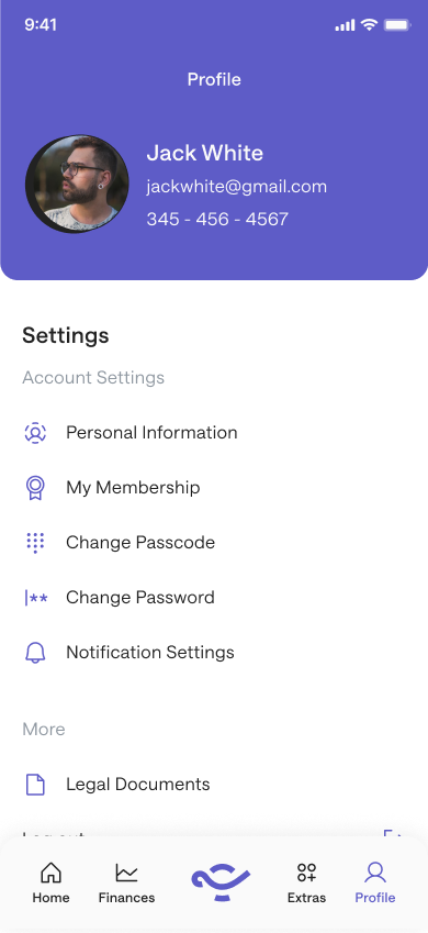
External Lead Designer on the full Credit Genie redesign — every flow, every screen, every UI component across onboarding, the cash-advance product, finances, insights, offers, profile and membership management, plus a documented design system for engineering handoff. The UX and UI architecture I shipped is what's currently live in the app, with branding (color, typography, illustration) evolved by the in-house team post-launch. Currently 4.8★ from 94K+ App Store ratings on the US App Store.
Why This Category Is Harder Than It Looks
Cash-advance is one of the most regulated consumer fintech categories in the US — state-by-state lending rules, fee transparency requirements, and a customer base that is, by definition, financially stressed. Users arrive at the product because they need money before payday. Every interaction has to balance speed (they need it now) against transparency (they have to understand what they're agreeing to) against trust (they're handing you their bank credentials).
Designing for this user is not designing for the median fintech customer. It's designing for someone whose attention is split, whose patience is short, whose trust threshold is high, and who has often been burned before by predatory products in the same category.

Onboarding — The Trust Bottleneck
The hardest screen in the product is the one that asks the user to link their bank account. Bank linking is the activation gate — without it, no advance can be calculated, no underwriting can happen, no money can move. With it, the user has handed over the most sensitive credentials they own.
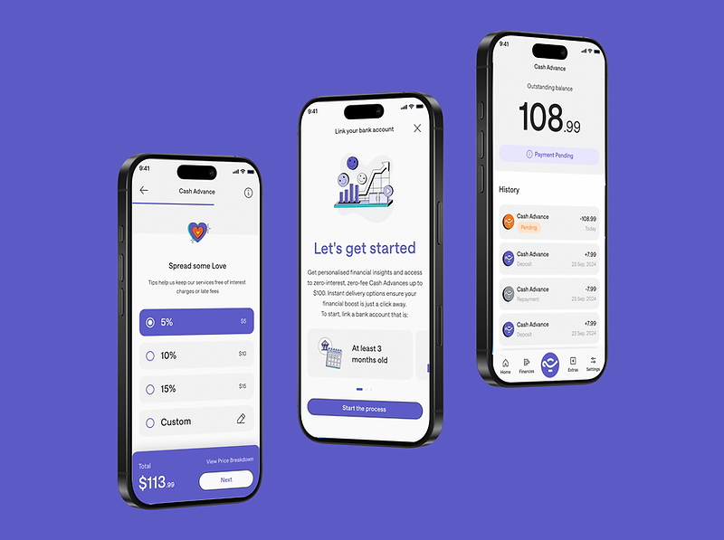
The design problem isn't reducing friction on this screen. It's earning the friction by making the value proposition explicit before the ask. The "Let's get started" flow leads with what the user gets — instant insights, zero-interest cash advances, fast delivery — before it asks for the bank link. The link itself is presented as a one-tap action with clear language about what happens next. The bank-old-enough requirement (at least 3 months of account history) is surfaced upfront, not buried as a post-link rejection.
The Advance — Designing the Tip Selector
The cash-advance flow uses a tip-selector mechanic — 5%, 10%, 15%, or custom — to fund the service. The tip is voluntary. It's also the primary revenue model.
This is the screen where ethics and conversion meet hardest. A pre-selected high tip optimizes revenue but feels manipulative. An unselected default optimizes user trust but tanks conversion. The shipped pattern — a clearly-labelled selector with the impact of each tip on the total visible in real time, plus a custom option that gives users full control — was the result of multiple iterations to find the version that converted without coercing.
The "Spread some Love" framing is a deliberate choice: the language treats the tip as a contribution to the service that keeps fees-and-interest-free advances available, not as a hidden charge. That framing is the thing that lets users feel okay about choosing 5% instead of 15%.
Repayment — Keeping the User Oriented
The repayment screen does two jobs at once: tell the user exactly what they owe, and make the history of their advances visible without overwhelming. The shipped pattern leads with the outstanding balance as the dominant element, surfaces the most recent activity (cash advance, deposit, repayment) in chronological order beneath, and uses status indicators (Pending, Today, dated) to keep the user oriented in time. The bottom-tab navigation (Home / Finances / Extras / Settings) keeps the rest of the product accessible without making this screen feel like a dead end.
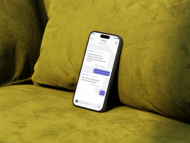
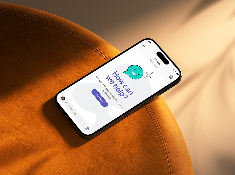
Live-Agent Support — When the Product Fails
Cash-advance products fail users in specific ways: bank links break, advances get rejected, repayments don't process. When that happens, the user needs a human, fast.
The chatbot screen ("How can we help?" with hours posted, live agents Monday–Friday 8am–5pm Eastern Time) is structured as the entry point to that human, not as a deflection layer. The bot exists to triage and route — it asks structured questions, escalates to a live agent when the issue is real, and confirms identity through the last 4 digits of the user's account before discussing anything sensitive.
What This Engagement Was Actually About
Cash-advance is one of the few categories where bad UX has direct ethical consequences. A confusing tip selector becomes a hidden fee. A friction-heavy onboarding becomes a barrier to people who actually need the product. A poorly-routed support flow becomes a trapped customer.
The engagement was about designing every surface of the product so that the user knew, at every moment, what was happening to their money and what they were agreeing to. That's the bar in regulated consumer fintech. Anything less is the wrong product for the wrong user.
What I Shipped
The full Credit Genie product surface — onboarding through profile management — built on a documented design system handed off to the engineering team.
Results — Live in the App
- 4.8★ App Store rating · US App Store (as of May 2026)
- 94,000+ ratings · live product, ongoing iteration
Gallery
Outcomes