EdTech · Coaching Marketplace
CoachMe — Strategic Performance UI
Two years, two shipped versions, two user roles — redesigning a coaching marketplace from mid-MVP to a performance-driven platform that kept growing even as the startup pivoted.
Scope
Mid-MVP, Two Roles, One Broken Home Screen
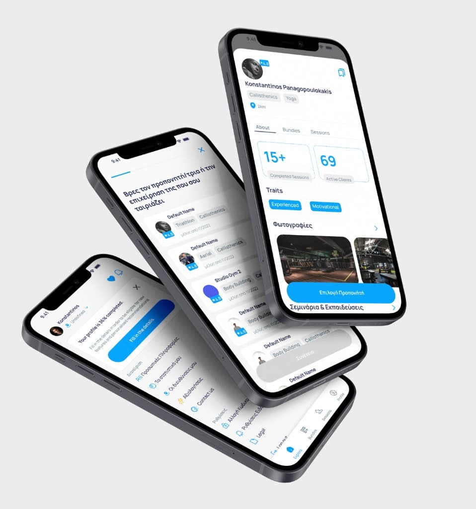
CoachMe was a marketplace for sports professionals — coaches, trainers, nutritionists — and the athletes who wanted to find them. When I joined the team as a freelance product designer, the MVP was already live but struggling. The core problem wasn't missing features; it was that the home screen didn't know who it was talking to.
The app had two fundamentally different user types: Professionals (vendors offering their services) and Athletes (buyers looking for guidance). The MVP treated them almost identically on first load. An athlete opening the app for the first time faced a browse screen with no orientation, no recommendation logic, and no way to quickly filter by what actually mattered to them — their sport, their goal, their level.

The Disclosure Effect: Onboarding as Matching Engine
The solution wasn't a smarter algorithm — it was a smarter first conversation. I designed a progressive disclosure onboarding flow that launched on first entry: a short, low-friction sequence of steps that asked athletes what they were training for, what kind of support they needed, and what their experience level was.
This wasn't just a preferences screen. It was the matching engine. The answers fed directly into a personalised home feed — surfacing the right professional profiles, practice recommendations, and featured coaches before the user had to do any searching. For athletes who didn't know what they were looking for, we gave them enough scaffolding to discover it.
For Professionals on the other side, onboarding focused on profile completeness and visibility — nudging vendors to fill in the data points that athletes would actually filter by. Two roles, two completely different first experiences, one coherent system.
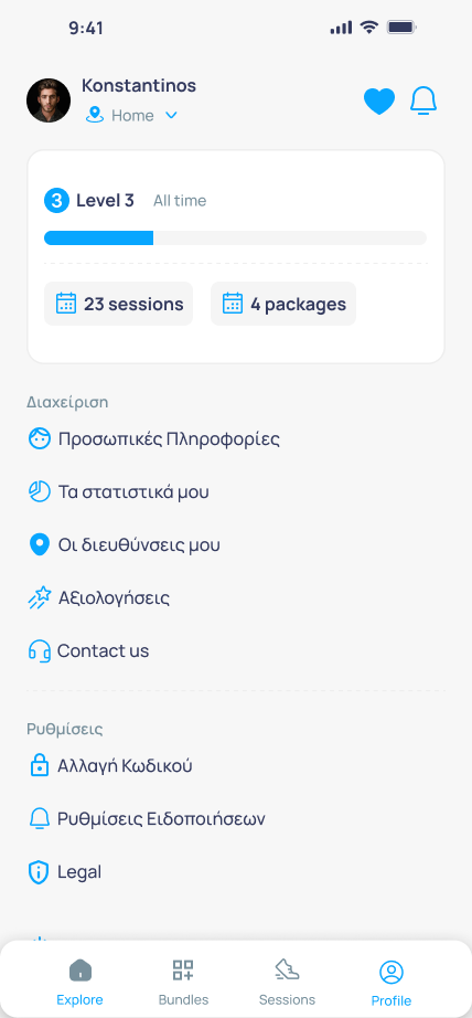
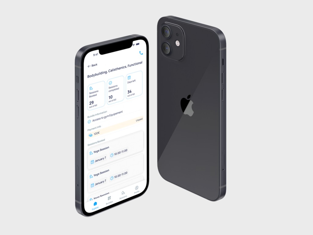
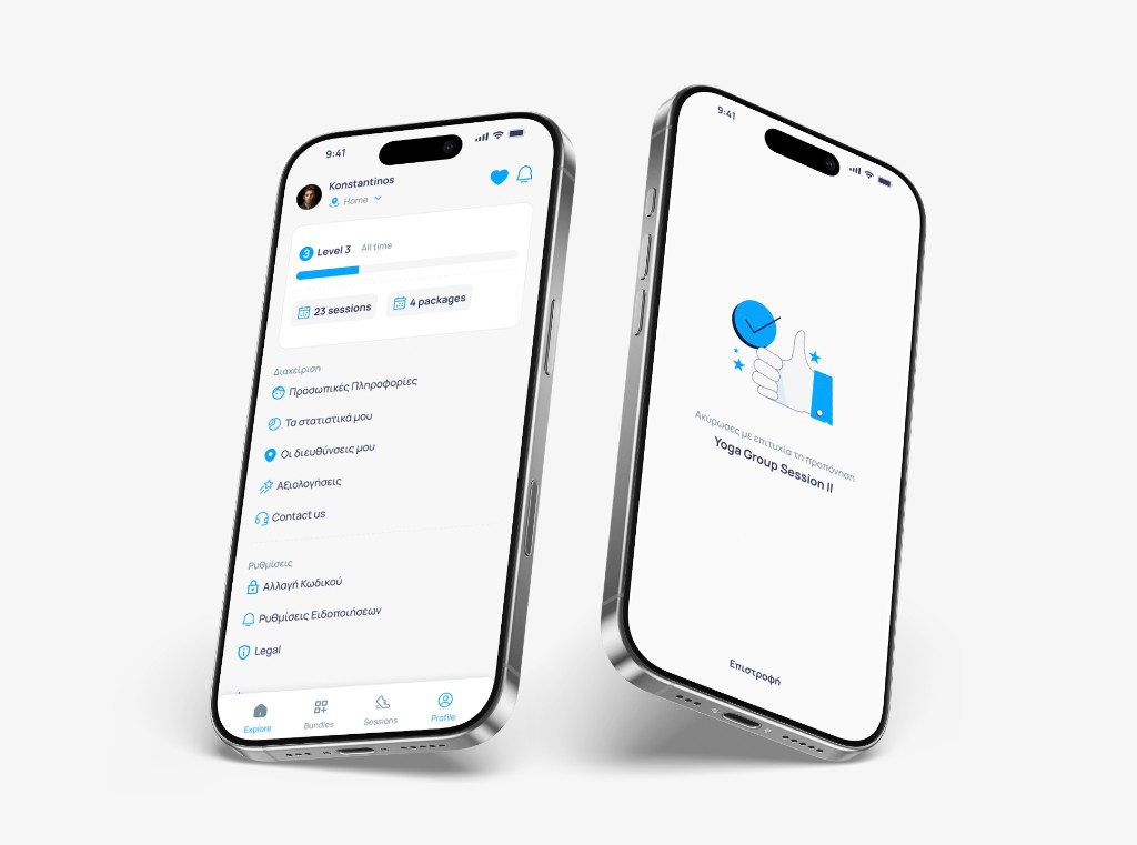
Unified Session Dashboard
Beyond onboarding, the ongoing session experience for both roles had the same underlying problem: state was scattered. Athletes couldn't easily see their upcoming sessions, progress notes, and coach communications in one place. Professionals were managing bookings through a patchwork of notifications with no unified view of their schedule and client roster.
The Unified Session Dashboard brought these together — one surface per role that served as the operational centre of the app. For athletes: upcoming sessions, recommended next steps, coach messages. For professionals: daily schedule, client history, booking requests, earnings at a glance. The goal was to make returning to the app feel purposeful rather than disorienting.
Two Years, Two Versions
The engagement ran for two full years, through two major version releases. V1 focused on stabilising the core matching and session experience — fixing the home screen, shipping the disclosure onboarding, and establishing a coherent visual language. V2 went deeper: expanded professional profile tooling, refined the athlete journey based on real usage data, and introduced a brand evolution that could stretch to new coaching niches (fitness, nutrition, mental performance) without fragmenting the design system.
User numbers grew across both releases. The platform was working — and the data from V2 confirmed it. Support load dropped 20–30% compared to V1, a direct signal that the interface was becoming self-explanatory. More telling: professionals stopped treating the app as a discovery surface and started using it as their primary booking and client management system — a shift from passive listing to active daily tool. That's the benchmark for real product-market fit on the vendor side.
What Good Design Can and Can't Do
CoachMe was a self-funded startup with a small, committed team. The product design delivered — user growth was consistent, session engagement improved, and the matching experience genuinely worked. What didn't hold was the business model: monetisation, sales velocity, and the commercial path didn't scale the way the team had planned.
This is one of the most important lessons I carry from this project. A well-designed product can grow a user base and earn genuine engagement. It cannot substitute for a viable business model. The two are separate problems, and understanding where design's responsibility ends — and where business strategy begins — is part of what makes a designer genuinely senior.
Results
- Two full app versions shipped over a two-year engagement
- −20–30% support ticket volume from V1 to V2 — the interface was becoming self-explanatory
- Professionals shifted from passive listing to active daily use for booking and client management
- User base grew consistently across both releases
- Design system extended to cover fitness, nutrition, and mental performance coaching niches without fragmentation
Postscript
CoachMe shut down in 2025. The product worked; the business didn't outlast its funding runway. I keep this case study because it's an honest record of what product design can and cannot do. Shipping a product that people genuinely use — and then watching it close for non-design reasons — is a different kind of education than shipping to scale. Both are real.
Gallery
Outcomes